

The MAAFA Redemption Project: Website Redesign + Usability Testing
Redesigning a UX-researched website for a non-profit organization
Redesign + Evaluative Research Project
Summary
Mission
The Executive Director of the MAAFA Redemption Project wanted professional redesign of their website. Since UX research had not been part of the initial website design, I injected it along the process for this redesign.
Outcome
We focused this redesign project on rebranding the organization, reorganizing the website, and increasing visitor trust. Weeks of reviewing testing strategies, branding approaches, and testing results resulted in a website meant for ‘the next level for messaging and marketing’ all by staying within the Wix platform and the Paypal donation page.
Impact
This redesign was successfully launched in December 2020. The Executive Director was super excited for the new website, and through Wix analytics, we’ve seen an increase in unique visitors per week, a decrease in time spent on the website, and successful benchmark comparisons with other social nonprofit websites.
Services
Contextual research
Website analysis
Design strategy
Branding research
Mood boards
Style tiles
Testing strategy
Open / closed card sorting
Tree testing
Wireframing + prototyping
Moderated user testing
Testing synthesis
Quantitative analysis
Qualitative analysis
Testing results presentation
High-fidelity UI design
Updated Wix website
Date
Aug - Dec 2020
Project + Process
Problem: The MAAFA Redemption Project badly needed a website redesign
In mid 2020, the MAAFA Redemption Project received a sponsorship grant from the Oprah Winfrey Charitable Foundation; with the political and social events around the Black Lives Matter movement, the MAAFA Redemption Project was gaining more traffic to their website.
The Executive Director wanted to have a “professional” redesign of the website. In an onboarding meeting with the executive director and assistant, I learned this redesign should accomplish three goals:
Rebrand the Maafa Redemption Project
Reorganize the website
Increase trustworthiness of the website (for donations)
I also learned that the Executive Director designed the site, and didn’t include any UX research in his process; since I’d lead the design for this project, I insisted on also injecting our process with UX research.
Problem: mobile users are low-earners.
John Hancock (JH) is a life insurance provider and long-time partner of the Vitality Group. JH insurance holders use the Vitality Program mobile app and website to complete activities like getting regular biometric screenings completed and engage in healthy behaviors to earn points and move up in Vitality status. By increasing their Vitality Status, insurance holders get discounted premiums and access to increasingly better rewards like discounted Apple Watches, gift cards, and cash back on groceries. The more members do healthy things, the better their rewards.

For this project, I worked directly with the MAAFA Redemption Project’s Executive Director and Executive Assistant.
Analyzing the current website
After analyzing the website, I highlighted some potential pain points that I wanted to address in the redesign:
Homepage doesn’t introduce users to what MAAFA is
Low fidelity photography
“Who we are/What is MAAFA” could be condensed into one page
“Features in the news” doesn’t allow for expansion and more features
Gallery is nice, but what purpose does it serve?
“Contact” page is hidden under “More” tab
Donate button is somewhat hidden, and opens a small PayPal popup
Donation page should reference 501(c)(3) certification to increase trustworthiness
I hoped to verify, address and resolve these with UX research throughout the design process.
Finding MAAFA’s Branding and UI Approach
In early meetings with the internal MAAFA team made up of the Executive Director and the Executive Assistant, I learned that they described MAAFA’s brand as friendly, trustworthy, professional, and inspiring. When asked which celebrities MAAFA would be, they looked to the Obamas, Ben Mays, and Kanye - regal, approachable, inspirational, but also creative.

The MAAFA team personified their nonprofit group with adjectives and celebrities.
I also looked for inspiration from the MAAFA team; when asked, they revealed they wanted to emulate the brands and websites of Chicago Cred, the Emerson Collective, and the Obama Foundation websites.

One of our goals was to emulate the branding and experience of these websites.
I took notes on the experiences for each of these websites, and made a list of takeaways that I wanted to emulate in MAAFA’s branding:
Light UI is a common theme
Consider a minimal approach with a lot of negative space
If they plan on getting more hi-res photos, we can also use large/high-res photography
We can create a newsletter archive similar to the way the Obama Foundation lists their blog posts
The Donation button must be shown on every page prominently
The Donations page should be cleaned up and supported on a new page
Include the social media links in the footer
Blue can be used as a recurring color, an accent color, or in conjunction with black/white branding
I then created some moodboards that captured this feedback, as well as style tiles that translated the moodboards into UI; the style tile the MAAFA team chose would evolve depending on the customization limitations of WIX’s platform.

Each of these moodboards and their style tiles attempted to address the observations and takeaways from the branding discussion with the MAAFA team.
Discovering the website architecture
Since no previous UX research was done for this website, I decided to start with figuring out how the site should be organized.
Open Card Sort
The MAAFA team listed pages and features they wanted to keep in the website as well as some new pages they wanted to introduce:
About MAAFA
Subscribe to newsletter
Mentions in the news
Corporate sponsorship
Volunteer opportunities
Employment opportunities
Contact
Social media
Current corporate sponsors
Address
Phone number
Email address
Donate
501(c)(3) certification details
Newsletter updates
To learn how users thought this kind of information should be organized on the website, I created cards for participants to sort them in an open card sort on Optimal Workshop:

Cards listing some specific features, pages, articles, and information relevant to MAAFA’s experience on Optimal Workshop. Participants were also responsible for labeling card groups.
I recruited ten participants similar to MAAFA’s ‘typical user’. Since this method used only ten participants (the max number I could include on a free trial of Optimal Workshop), I was able to pull similarity matrices, dendrograms, and 3D cluster views based on the various categories participants created.

The similarity matrix shows a kind of ‘heat map’ on how the participants thought individual cards should be grouped together.

The best merge method dendrogram makes assumptions about larger clusters based on how often participants paired individual cards.
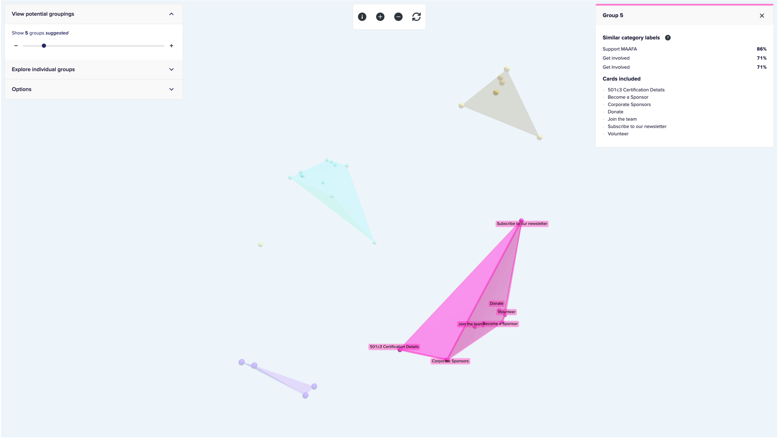
The 3D cluster view visualizes the similarity between cards by showing polygons over similarly grouped clusters of cards. Here, a cluster of cards participants thought should be labeled as “Support MAAFA” or “Get Involved”.
Generally, I decided that the most common categories we could use for the site would be:
About MAAFA
Contact Us
Follow Us
Get Involved
In the Media
Newsletter and Blog Posts
Support MAAFA
Closed Card Sort
To verify these categories, I set up a closed card sort through Optimal Workshop; ten new participants were recruited to sort the same cards from the open card sort into the seven categories. I was able to pull the same analyses in the closed card sort, verifying the accuracy of these categories for users.

The closed card sort similarity matrix shows a much more segregated heat map of the cards’ pairings.

The closed card sort best merge method dendrogram showed slightly more defined clusters than in the open card sort.

The closed card sort 3D cluster view shows much more segregated (but slightly more) groups than in the open card sort.
Tree Testing
I wanted to make sure users could navigate through the website given the new organization; to measure this without a clickable prototype, I used Optimal Workshop’s tree testing feature. I used the categories discovered in the card sort activities and created targets similar to the cards under each of them.

In a tree test, participants use only labels to navigate the ‘website’.
To mimic the goals that the MAAFA team wanted the website to accomplish, I tasked 12 new participants with finding the donation page, an article mentioning MAAFA in the media, and a way to subscribe to their newsletter. (With the Optimal Workshop free trial, I was allowed only 3 tasks.)

I set up participants with hypothetical tasks in MAAFA’s website.
Generally, the participants were successful in finding each of the target pages using the navigation.
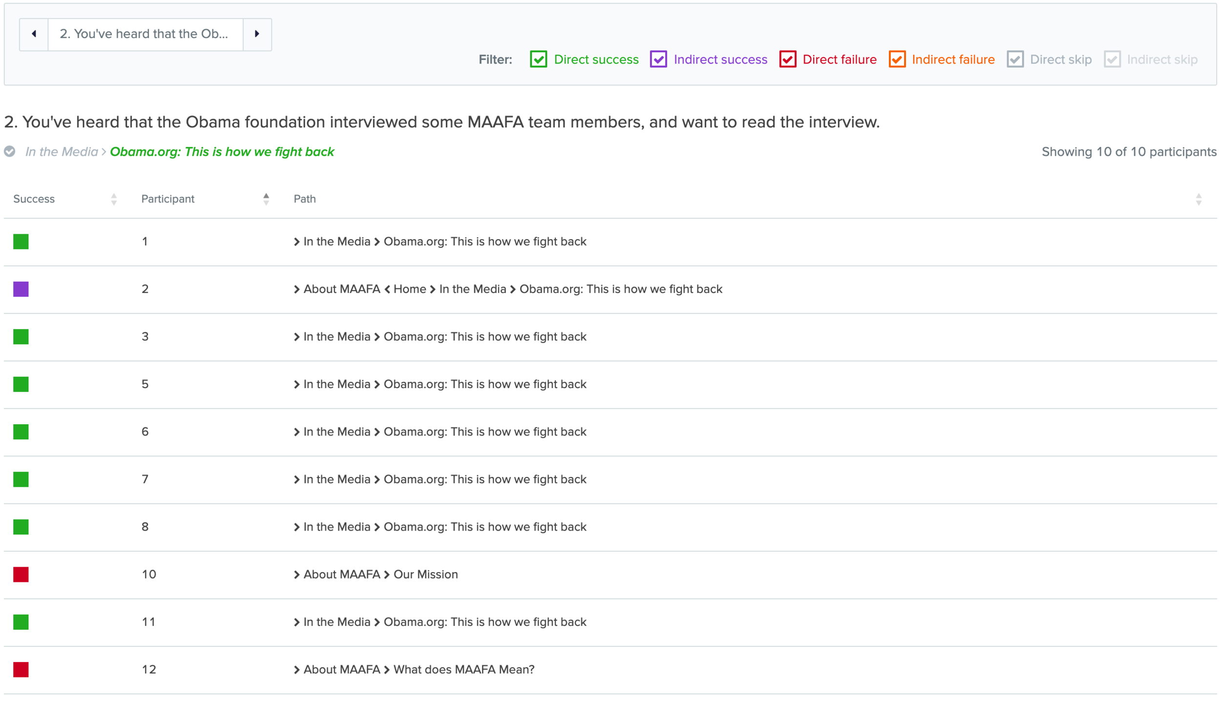
In this example result, participants generally were successful in finding the Obama.org “In the media” page.
Empowered with this data, I was ready to translate this organization and navigation into wireframes.
Designing wireframes
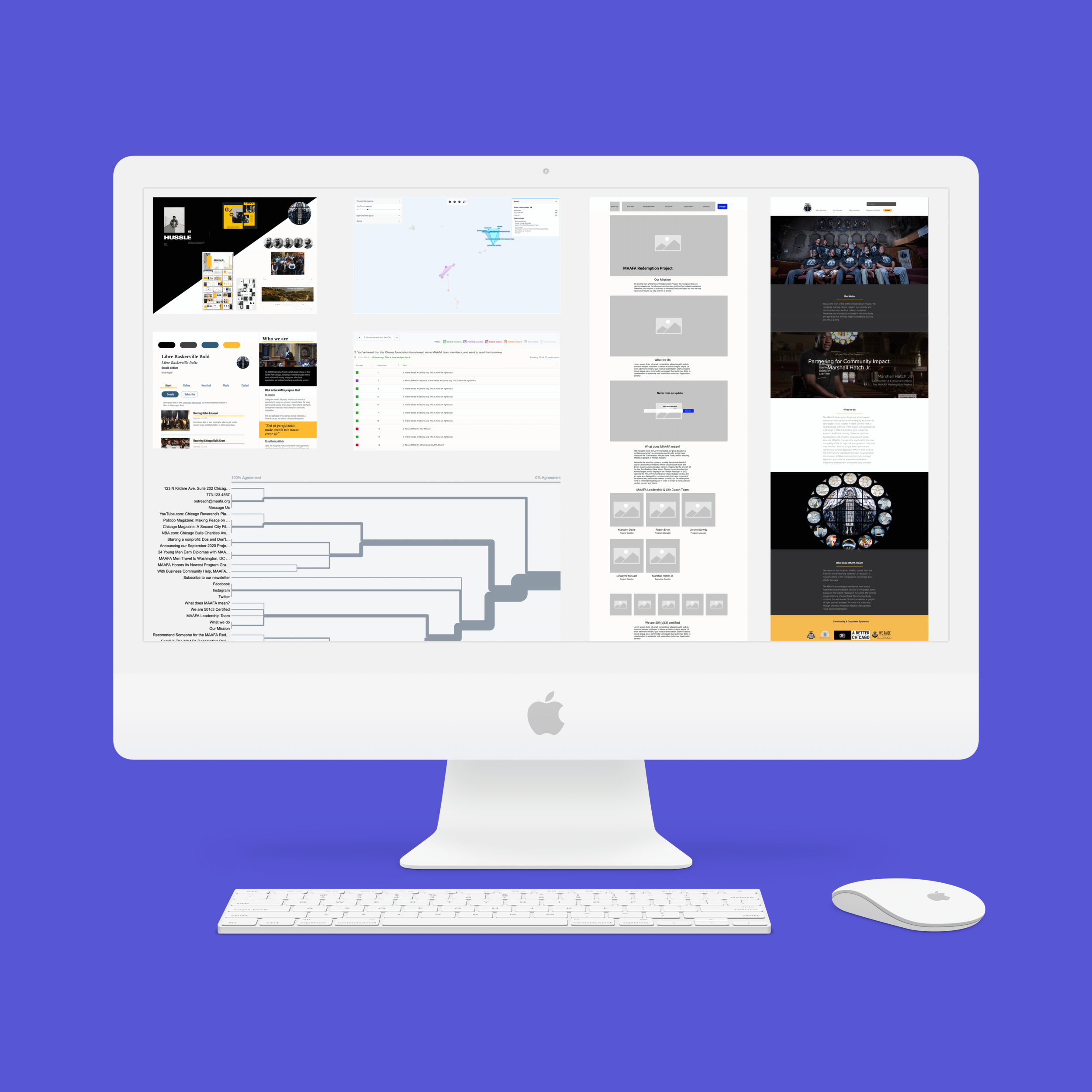
So the wireframes could be easily accessed by the MAAFA team, I designed them as a clickable prototype on Figma.

Building the wireframes on Figma allowed me to create clickable interactions and also send the prototype to the MAAFA team.
Evaluating the prototype’s usability
I wanted to make sure the website was navigable, and user-tested the wireframe prototype with 5 participants. By testing at this stage, I would make sure the participants gave feedback based on the organization, navigation, and content instead of focusing on the UI.
Participants were tasked with finding the same three pages of the website as in the tree test, and provide comments/feedback about anything about the website they saw along the way.
Some questions I asked participants:
Where are you interested in clicking on?
Let’s pretend you wanted to make a donation - how would you go about doing it?
You know that some news articles, videos, and blog posts have featured MAAFA. Where would you find these articles, videos, and blog posts?
Where would you go to subscribe to MAAFA’s newsletter?
What do you think about the organization of this website?
User testing interviews revealed:
Participants generally could navigate this website.
Participants were okay with donating through PayPal.
Subscribing is easy when it’s on the homepage and newsletter page, but it should be included in the footer.
They liked and preferred having the ‘about us’ details on the homepage.
They never fill out contact forms - they prefer email addresses.
The Get Involved page is easy to scan and very straightforward.
Even though the logo is highly detailed, users will click on it to navigate to the homepage.
I made updates to the wireframes based on this feedback, and presented the updated version to the MAAFA team.
Testers said good things about this solution.
“I’m not sure I’d expect to donate through a GoFundMe - I might trust it more if I knew this were going straight to the church or whoever is responsible for the program.”
“One issue I have when I visit vendor pages, most of the times, I don’t want to submit a question on this page. I DO want to send it from my own work email, so I usually look for even a general email.”
“I kinda dig how you're combining the concept of a landing page and what normally goes in a separate "About Us" section - having a lot of that info front and center feels like an easy way to get that info without having to dig.”
Applying UI to the wireframes
With a user-tested wireframe experience, I wanted to give the MAAFA team some UI approaches for the website based on the preferences for style tiles developed earlier.
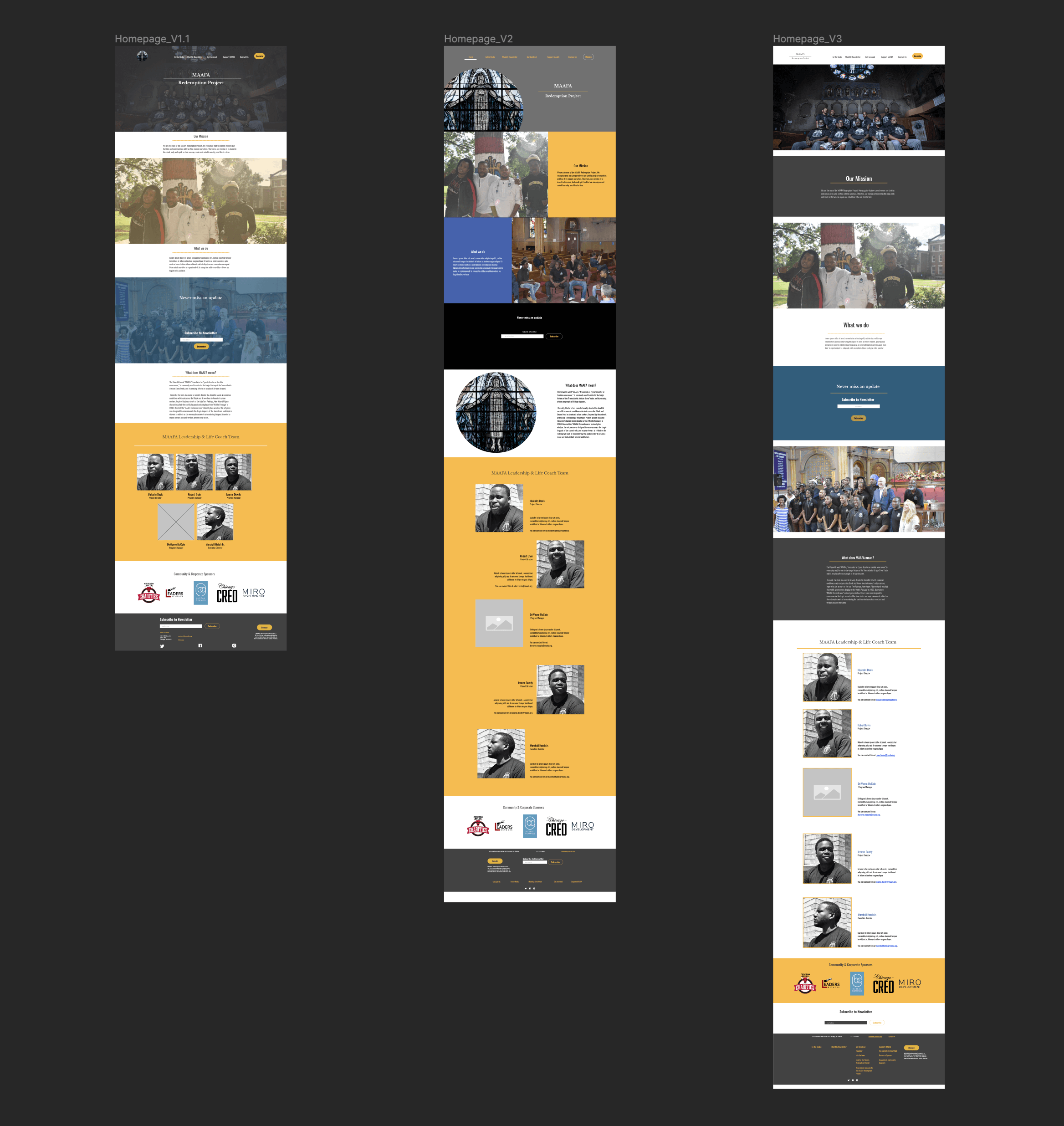
Here, I applied the UI developed in the style tiles to the home page.
You can view the different homepage UI approaches here on Figma.
In a meeting, the MAAFA team and I decided to continue with the third option since it included the least editing of photography, we could guarantee color contrast compliance of content, and just came off as the most ‘clean’.
Building and adapting the designs on Wix
Instead of designing the rest of the website screens with the UI we landed on, I went straight to Wix to learn how much of this design could be recreated. Wix had some limitations in UI customization, and I made sure to convey these limitations to the MAAFA team.

The differences between designing on Figma and executing on Wix.
In the end, I was still able to stick to a very close replication of the UI originally presented. You can view the live website here.
Outputs + Deliverables
Open + Closed card sorting analysis
Tree testing analysis
User testing feedback + summary
Clickable wireframe prototype
Concept UI visuals
Final website
Next Steps + Recommendations
This website is live!
Some content is too long, where others are too short; the team would benefit from content management.
Individual leaders should have contact emails instead of one generic email.
Additional user testing for this current state.
Plan another round of goal setting, usability testing, and design updates.
Reflections
What went well:
Small scale testing and research helped build a solid navigation
Digging through Wix, I learned the team had not been receiving many messages
The Executive Director was wildly excited to have this site up and running, but to have a professional site
Challenges:
Limitations of Wix customization
Last minute additions to navigation
Lack of content management
What we validated:
Users can easily discover and navigate this website
References to 501(c)(3) certification increase trustworthiness
Home page can be used as an “About” page
What we disproved:
Users don’t trust PayPal for donations
Users will fill out contact forms
Users won’t click on the logo to navigate back home
Analytics
The MAAFA website went live in December 2020. Since then, according to Wix analytics:

The MAAFA website has 80% more unique visitors, 64% better session duration, 70% more returning visitors, 76% more organic search appearances than other social nonprofit websites using Wix.

While the desktop website has about 20% more unique visits in a week today compared to a year ago, the mobile website has 207% more unique visits in a week today compared to a year ago.

Individual pages are either opportunity or risk pages since users commonly leave after some (What is MAAFA), experience a big rise in traffic (Who We Are), spend more time on the page than any other (What is MAAFA), or the most popular page visitors navigate to is the Leadership Team page.
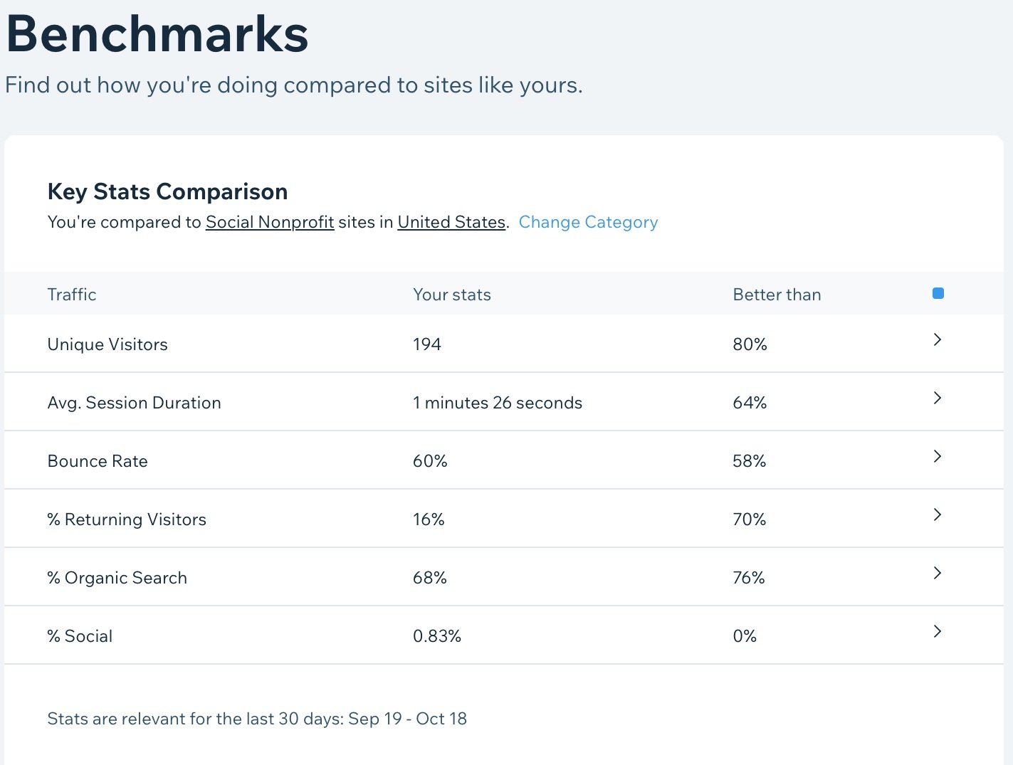
Visitors spent an average of 1 minute 26 seconds on the site, better than 72% of other sites on wix in the social nonprofit category. A year ago, visitors would spend an average of 5 minutes and 39 seconds on the site. (This decreased time is considered an improvement.)
If you liked what you saw here and want to work together, get in touch!
More case studies
-

Generative research
-

Evaluative research
-
Mobile app redesign